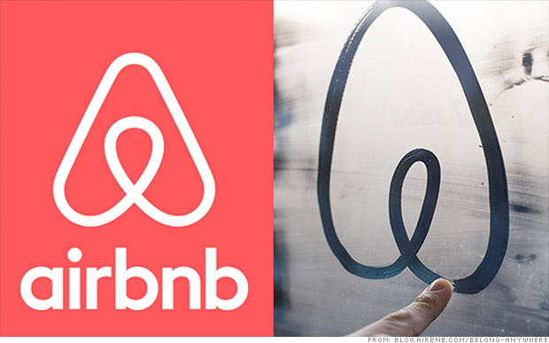
Airbnb released a new logo yesterday, and it looks like a... well, judge for yourself. The online rentals site said the new logo, dubbed "Bélo," is supposed to convey a sense of "belonging." Plenty of people on social media aren't seeing that. They're looking at two bulbs dangling and the circle-within-a-triangle design, and saying what your middle schooler and your psychotherapist were both thinking: That looks like genitalia. The Internet seems split on whether it's male or female genitalia - or both. Breasts and a rear end have also been discussed. But reaction on Twitter has been fairly unequivocal - something's amiss about Airbnb's new logo. Here's what the Twittersphere think:
- "looks majorly obscene," @LouiseMensch tweeted on Wednesday afternoon.
- @TadCarpenter cracked that the "Airbnb's new logo is probably my favorite testicle based logo for sure."
- "I think the new airbnb mark is thoughtful and well done, and anyone who says it looks like genitals is just a big weiner," wrote @zohf.
That about sums it up, doesn't it? Airbnb explained in post on its website that new logo incorporates symbols like an upside-down heart, a mobile map-app pin (in the center), and a letter A for Airbnb. They wanted the logo to be simple to draw so that users can post the logo as a welcoming gesture.

No comments:
Post a Comment